Brands Powered by Illustration
Have you ever considered using illustration as a key component of your brand? Have you noticed how other brands are leveraging illustration to get an edge in the crowded marketplace? Companies, big and small, are increasingly using this secret weapon and I’d like to talk about how and why they do this.
There are several advantages to using illustration as a part of a brand identity. One advantage is that it can easily provide a point of difference for your business. The illustration process is a custom one. So your core values, brand mission, your overall vibe can be built into it. When compared to stock photography this is a huge advantage because you are communicating a unique and personal message.
This leads me to the next advantage which is that it’s much more engaging. Illustration garners more attention because it is unexpected. Especially if it has been commissioned specifically for you and your brand’s message. And you may be surprised at how cost effective this can be. The price can often be comparable or cheaper than using stock photography.
Another advantage is that illustration is very human. A custom illustration when used correctly can help to elicit an empathetic response rather than an angry response. In their early days Dropbox used illustration by Zach Graham on their “please don’t downgrade” page to help users understand that they got great value for money with their current plan. This illustration is said to have potentially saved them millions of dollars.

Artwork by Zach Graham for Dropbox
It can also be used as the cornerstone of a brand identity. For example Sailor’s Grave Brewing uses illustration from a small collection of artists who all use hand crafted, traditional techniques and media to communicate their hand crafted and artisanal brewing methods. They produce beer in the town of Orbost, a rural town next to the Bass Strait so the subject matter speaks to this with plenty of rural and maritime scenes throughout their visual communications.

Artwork from the Sailor’s Grave home page
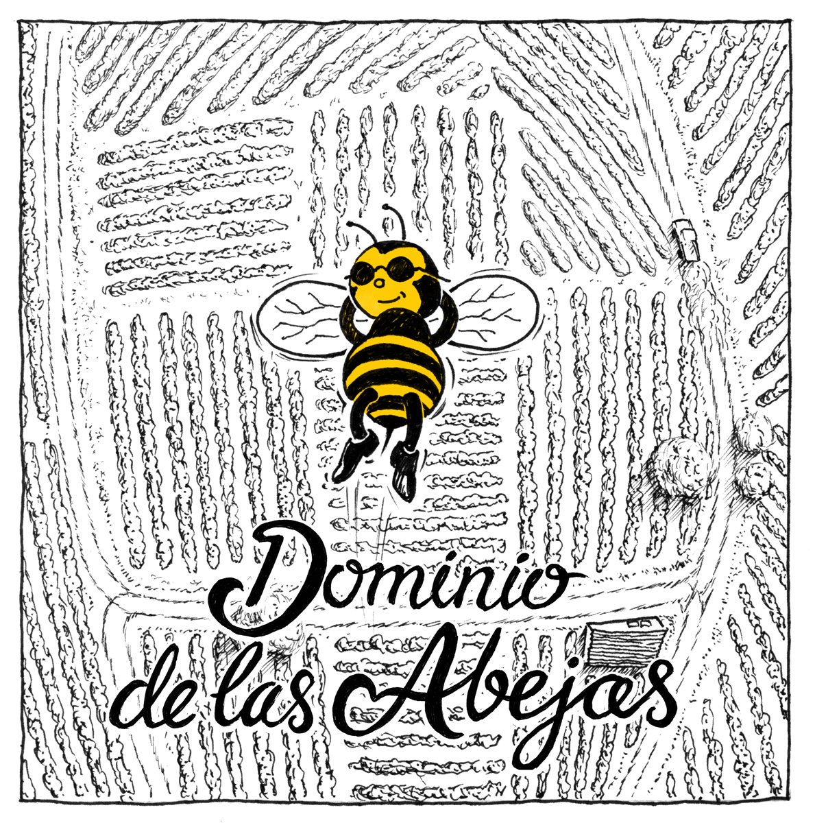
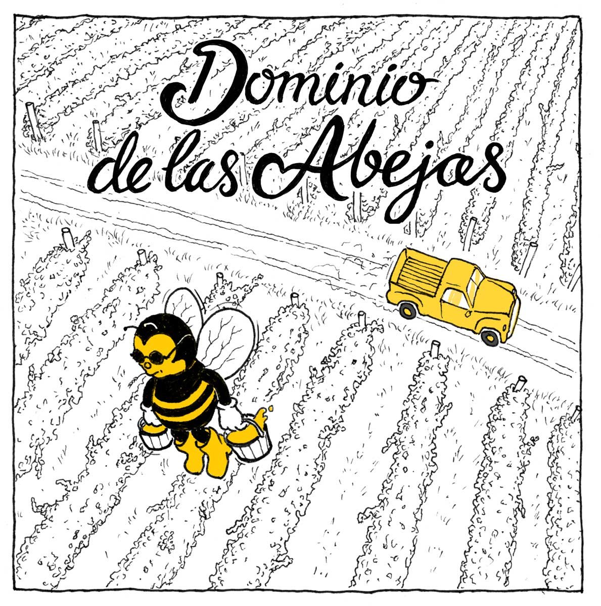
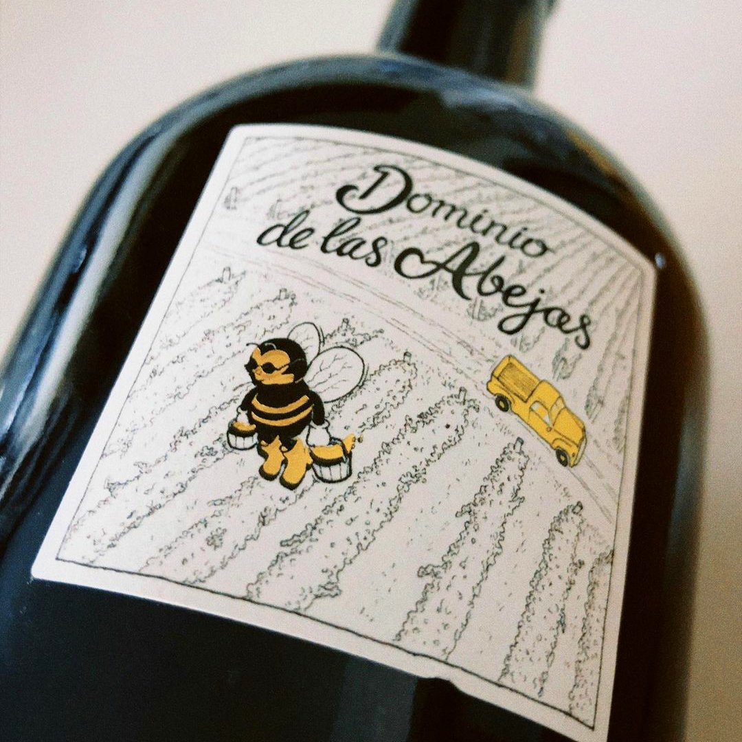
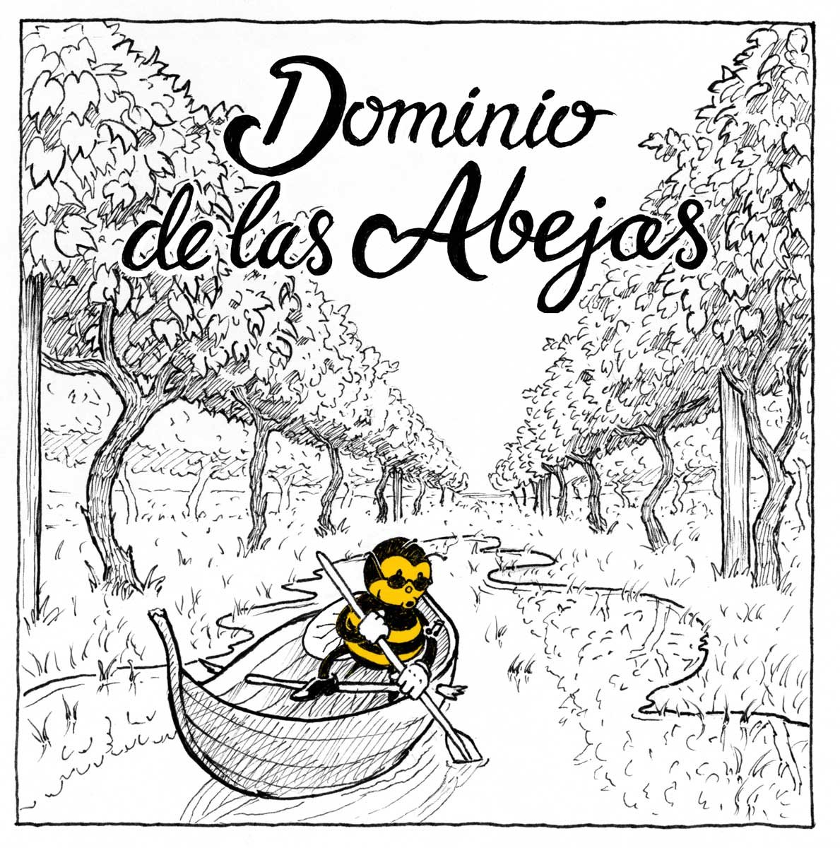
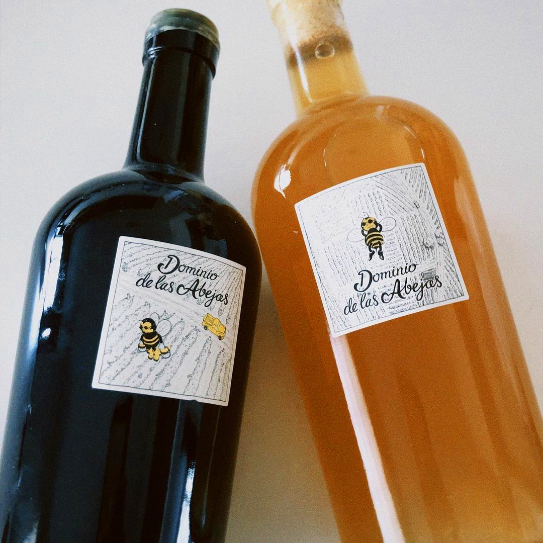
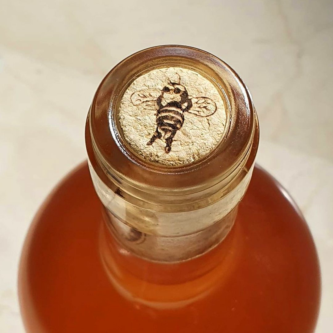
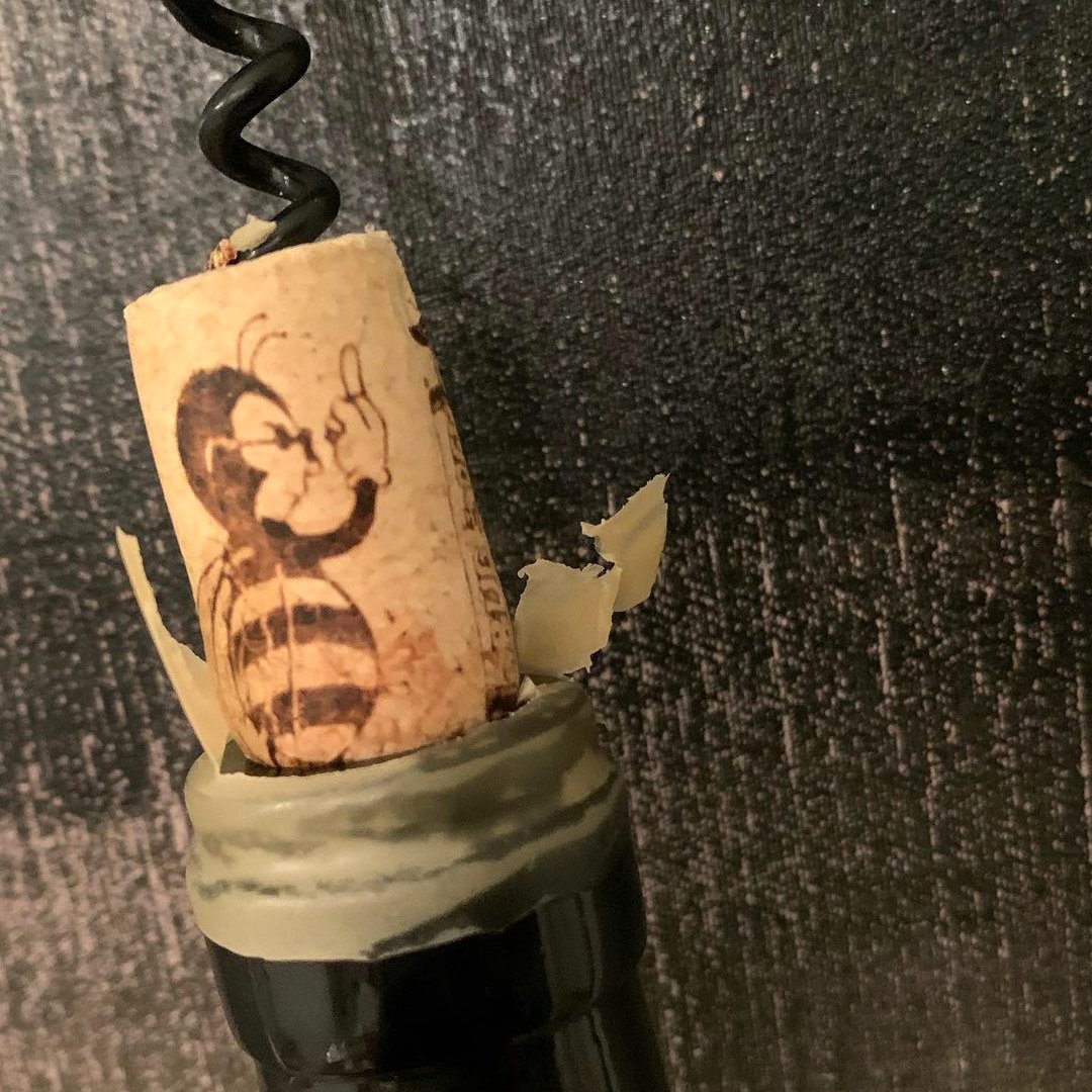
I used it myself with Dominio de las Abejas, Mexican wine makers from the Ojos Negros Valley, Baja California. The brief was that these wines are all on the "natural wine" spectrum, which means that they grow the grapes quite organically and sustainably, and the wines don't get any additives which allows for the wines to be true reflections of their origin. The inspiration for the name comes from the fact that in a happy ecosystem, without pesticides or herbicides, bees like to be floating around the vineyards, which is an indicator of the overall health of your vineyard. So in a good healthy block, bees reign supreme!
With that in mind I created these illustrations using a traditional dip pen for their wine labels and packaging with a view to be used digitally for web and socials.
In fact there are so many applications for illustration. It can be used as a part of the logo itself, any brand related packaging, printed communication like postcards, flyers, posters or business cards, website assets, blog posts or articles, social media, they can be animated, or used for point of sale and signage etc.
The thing to keep in mind is that brand illustrations are an extension of the brand. They need some consideration and guidelines in order to keep them “on brand”, looking consistent and part of a cohesive visual identity.
There are several ways to do this:
Limit the colour palette to brand colours
Choose specific media to be used by the illustrator like for example charcoal, crayon, collage, or watercolour
When using digital illustration choose a certain lineweight like 2px
Use certain textures like halftones, scribbles or repeating patterns
Stipulate specific shapes to be used like triangles or ellipses
And that’s not to say the brand can’t evolve but if all of these constraints are detailed in a document or quick reference guide, you will be able to use various illustrators or a team of illustrators to produce beautiful bespoke content for your brand.
And finally the illustrator must know the audience and their aesthetic preference. What type of visuals will speak to a female millennial audience when compared with a male baby boomer audience? It’s important to dive into their world and discover their preferred visual language. This must be considered in the same way you might consider tone of voice.
All of these things, when implemented can give your business the edge over competitors, can generate a stronger, engaged connection and relationship with clients through storytelling and a more human form of communication, and can make your workplace a highly desirable environment to work in.
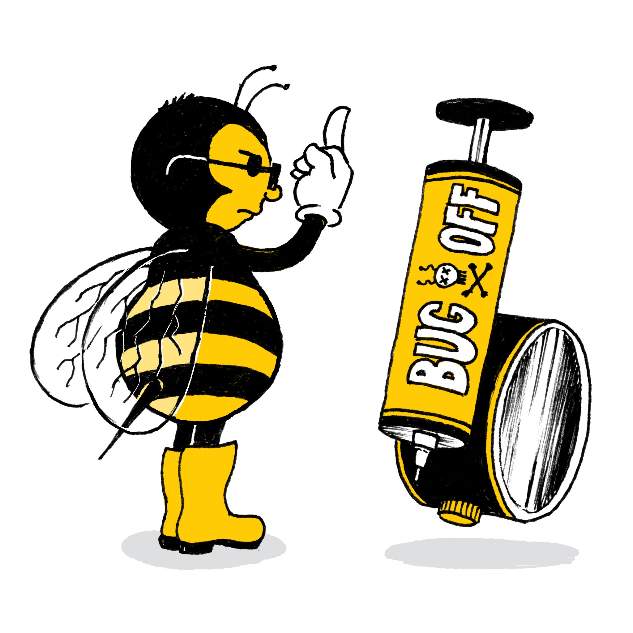
Written by Melbourne based artist and illustrator Eddy Sara.
If you’d like to talk about using illustration in your brand contact me here now!
To buy limited edition giclée prints or comics by Eddy Sara go here.